Table of Contents
This article includes the following sections to help you with analytics dashboards for the iCIMS Talent Cloud:
Overview of Analytics
iCIMS provides robust analytics that help you make sense of your candidate and hiring data so you can use it to make critical talent decisions. Through configurable dashboards that offer a detailed view of specific metrics—from hiring sources to career site performance and beyond—analytics deliver the information you need to reduce bottlenecks in your funnel, create an effective recruitment marketing program, improve diversity, optimize the candidate experience, and elevate your overall talent acquisition strategy.
Analytics are available for two products in the iCIMS Talent Cloud: iCIMS Career Sites and iCIMS Applicant Tracking (ATS).
For more on analytics—including how to authorize users to log in to the main Analytics page at analytics.icims.com—review the Getting Started with Analytics in the iCIMS Talent Cloud article.
Reading and Interpreting Analytics Dashboards
The main Analytics page at analytics.icims.com lists the various dashboards available for each of the three products. Each dashboard includes data pertaining to your organization’s specific usage of that product (e.g., the Search Behavior and Conversion dashboard for Career Sites); that data is measured and calculated automatically and updated in nearly real time.
Each dashboard on the Analytics page has a short description to help you better understand what data is included and to differentiate it from other dashboards. To open a dashboard, select its title.
Understanding Dashboard Layout
Each dashboard features several rows of tiles displaying graphical and numeric data, with each tile highlighting a separate metric (e.g., Top Keywords). Primarily, tiles display in one of these formats:
- Numeric factoid: A singular number quantifying a particular metric (e.g., 14: Number of Active Campaigns).
- Text factoid: A singular name or keyword, usually representing a metric’s highest or lowest value (e.g., Indeed: Highest Candidate Volume).
- Chart/graph: A visual representation of data (e.g., pie chart, line graph) showing the relationships between different data points.
While factoids are fairly simple and to the point, charts/graphs help you make comparisons of the data and identify trends and pain points in your recruiting or hiring efforts.
Pay close attention to the title of each tile, as certain tiles may seem similar but offer different types of information. For instance, for Career Sites, the Most Popular Keyword tile refers to the keyword with the most searches, while the Highest Converting Keyword tile refers to the keyword with the most searches that lead to applications started.
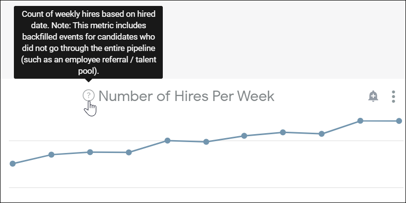
Tip: To get a better sense of what data is presented in a particular tile, select the circular question-mark icon within that tile. A tooltip opens with a short summary of what is being displayed.
For most dashboards, tiles are broken up into sections, enabling you to home in on metrics that are most important to you. In addition, you can utilize any of the available filters at the top to only display certain tiles on the page and hide ones you don’t need, as discussed in the next section, Filtering Tile Data.
Filtering Tile Data
Each dashboard comes with a set of filters to configure the tiles and information presented; upon opening the dashboard, some of these filters have a default value already provided. The filters available for each dashboard are listed in the product-specific sections below.
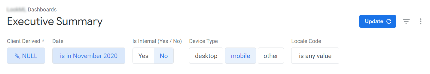
To update any default values or enable any of the other available filters, use the filter boxes at the top. Once you select the Update button at the top right, all tiles affected by these changes will automatically update.
For example, on the Executive Summary dashboard for Career Sites, if you only want to review data for mobile candidates in November 2020, you would set these filters:
- Date…is in November 2020
- Device Type…is mobile
Note: Changing a filter on a dashboard does not save that filter value; filters are reset to their default values for each new session.
Tip: When you change a filter on a dashboard, that filter change is reflected in the URL. Bookmark or share this filtered-dashboard URL to go straight to that dashboard next time with your desired filters already set.
Using Dashboards for iCIMS Career Sites
Since visitors can interact with a career site in numerous ways, it is important to understand the candidate journey and be able to recognize shifts in candidate behavior. Through Career Sites analytics, you gain valuable insight to help you optimize your recruitment strategies for active candidates and make smarter business investments. For example, through analytics, you can determine where and how many candidates are dropping off from the job application process before completion; then, if necessary, you can determine how to edit or rebrand the application to ensure a better submission rate.
Getting Started with Career Sites Analytics
Career Sites analytics are available for authorized users through the main Analytics page. Several distinct dashboards are included here, covering most aspects of your career site—from candidate activity and search behavior to site traffic and landing page performance.
For all Career Sites dashboards, the system collects a wide range of different data points and candidate actions. The following terms will help you understand the data available in these dashboards:
- Candidate (or Visitor): A unique individual browsing the career site. This is tracked using a cookie dropped in the candidate’s browser when they navigate to the site. This cookie expires if the candidate has not returned to the career site from the same device/browser within a 30-day time period.
- Session (or Visit): A candidate’s browsing session. When a candidate navigates to your career site, a session cookie is dropped in their browser. For analytics purposes, a candidate’s browser session is considered complete after 30 minutes of inactivity.
- Note: A candidate who leaves the site open in the background for more than 30 minutes and then resumes navigating the site will have two separate sessions.
- Apply Now Click: A click on the Apply Now button anywhere on your career site.
- Application Started (Login Successful): A job application started by the logged-in candidate, regardless of whether that application was submitted. An application is officially started when the candidate authenticates into the candidate portal and arrives at the first page of the application.
- Application Submitted: A job application submitted to your applicant tracking system.
- Active Job: A job that is live and accessible on your career site.
- Page View: A successful page load by the candidate.
- Link Click: A click on a link by the candidate.
It is also important to note that the system measures the occurrence of a given data point in one of two ways—either with a total count or a unique count.
- A total count refers to the way you normally count things. For example, the total number of link clicks in the past seven days is simply the number of times that visitors to your site selected links in the past seven days.
- A unique count refers to the number of unique browsing sessions (or unique visits) that are associated with a given data point. For example, the unique number of link clicks in the past seven days is the number of visits that included at least one link click.
For more on total and unique counts, review the Making the Most of Career Sites Data section below.
Viewing Career Sites Dashboards
The following dashboards for Career Sites are available from the main Analytics page. Some notable tiles are provided for each dashboard below; the full list of available tiles can be reviewed by accessing the dashboard.
Executive Summary
This dashboard provides a summary of candidate activity on your career site and offers specific insight about your recruitment efforts across certain date ranges.
- Available filters (and default filter values):
- Date...is in the past 24 weeks
- Device Type
- Locale/Language Code
- Is Internal Site?…is No
- Dashboard sections:
- Top Level Metrics: Key recruiting metrics, such as unique visits and submitted applications.
- Candidate Funnel: Drop-off at any individual step of the career site funnel.
- Time Series Breakdown: High-level metrics on a weekly basis.
- Desktop v Mobile: High-level metrics broken down by desktop versus mobile usage.
- Hiring Funnel: Analysis into the success of your hiring process.
- Notable tiles:
- Visits (Unique)
- Visitors (Unique)
- Apply Now Clicks (Unique)
Search Behavior and Conversation
This dashboard outlines how candidates search on your career site and if/how those searches lead to job applications. Most tiles reference search queries—unique job searches in a given session that returns results. For example, an initial search for package handler with no location entered is counted as one query; a second search with New York, NY entered as the location is counted as the second query.
- Available filters (and default filter values):
- Date...is in the past 24 weeks
- Is Internal Site?…is No
- Context
- Searches Included...is Keyword Only
- Keyword Terms (Keyword Search Only)
- Total Query
- Results Count
- User Country
- User City
- Device Type
- Dashboard sections:
- Query Conversion and Performance by Search Type: Candidates’ top keyword searches and a breakdown of the different search types available: location, job matching, and commute.
- Over Time: Search usage and query conversions (i.e., queries that lead to Apply Now clicks) over a period of time.
- Deeper Insights: A deeper dive into location-based data, such as top location searches and queries and conversions by candidates’ locations.
- Notable tiles:
- Avg. Query Conversion Rate
- Top Keywords
- Search Usage Over Time
- Top Location Searches
Vanity Context Performance
This dashboard outlines site traffic and conversions across your various vanity contexts (if you have any set up on your career site). A vanity context is a special URL path that filters jobs. For example, if you want to specifically advertise engineering jobs, iCIMS can set up a vanity context (e.g., https://jobs.icims.com/engineering) that only shows jobs from the Engineering job category.
- Available filters (and default filter values):
- Date...is in the past 24 weeks
- Context
- Visitor Country Code(s)
- Device Type
- Local Code
- Is Internal Site?…is No
- Dashboard sections:
- Notable tiles:
- Context Traffic and Conversion
- Link Clicks by Context
- Search Keywords by Context
Sources and Campaigns
This dashboard outlines which sources drive candidates to your career site and lead to job applications.
- Available filters (and default filter values):
- Date...is in the past 24 weeks
- Source/Campaign Name
- Source Code
- Two Letter Country Code (ex: US)
- Country Name (ex: United States)
- Language/Locale Code
- Req ID
- Job Location
- Job Categories
- Is Internal Site?…is No
- Dashboard sections:
- Conversion Sources: A breakdown of sources that lead candidates to apply to jobs.
- Influencing Sources: A breakdown of sources that drive traffic to your career site without directly resulting in successful conversions. A good example of an influencing source is an email campaign or job fair that leads users to visit a specific landing page but doesn’t directly provide an opportunity to apply for a job.
- Source Mapping: A list of source codes that your organization has uploaded, as well as the sources that those codes map to.
- Notable tiles:
- Top Conversion Sources
- Top Influencing Sources
Link Explorer
This dashboard looks at the performance of individual links on your career site, showing you what links candidates are selecting and how often they are selecting them.
- Available filters (and default filter values):
- Date...is in the past 24 weeks
- Link URL
- Link Context
- Page URL
- Device Type
- Locale/Language Code
- Is Internal Site?…is No
- Dashboard sections:
- Most Popular Links: The number of unique clicks on each link on your career site.
- Clicks Over Time: The number of unique clicks broken down by week.
- Demographics: Information about the device types, browsers, and operating systems of candidates selecting links.
- Notable tiles:
- Top Links
- Unique Clicks by Week
- Device Type Breakdown
- Browser Breakdown
- OS Breakdown
Application Insights
This dashboard looks at your career site’s apply flow, providing insight into how long candidates take to complete a job application and where in the process they drop off.
- Available filters (and default filter values):
- Date...is in the past 24 weeks
- Brand
- Locale Code
- Req ID
- Job Country
- Job State
- Job City
- Is Internal Site?…is No
- Gateway
- URL Host
- Job Title
- Device Type
- Job Category
- Dashboard sections:
- Applications Started and Completed: The total number of applications that were started (not necessarily submitted) and submitted.
- Applications Over Time: The number of applications in a given week.
- Top Sources for Applications: The sources attributed to applications on your career site.
- Application Steps: The number of times candidates have reached a particular step of your apply flow.
- Completion Rate over Time: A week-by-week measure of applications that were submitted.
- Application Duration: The amount of time that candidates spend on each step of the apply flow.
- Notable tiles:
- Duration by Application Step
- Application Completion Duration Over Time
Active Jobs and Job Counts
This dashboard provides a summary of active jobs, as well as a historical picture of the number of jobs posted in any given month.
- Available filters (and default filter values):
- Brand
- Country
- Locale/Language Code
- ATS
- Is Active…is Yes
- Job Category
- Tag
- Is Internal Site?…is No
- Date (Historical Data Only)
- Is Active? (Historical Data Only
- Job ID
- Dashboard sections:
- Active Jobs: The number of jobs and job postings that are live on your career and can be applied to. A job might have multiple job postings, such as when a recruiter posts the same job in multiple languages.
- Language Breakdown: The number of active jobs for each locale code (i.e., code that identifies the candidate’s browser language).
- Active Job Requisitions: A detailed listing of your active jobs.
- Historical Jobs Posted by Month: The number of jobs (both active and inactive) posted in any given month.
- Notable tiles:
- Active Job Postings
- Active Requisitions
Landing Page Analytics
This dashboard looks at the performance of individual landing pages on your career site. A landing page is a page on your career site that a candidate “lands on” after a selecting a link (from an email campaign, for example). Job search, job description, and apply pages are not considered landing pages.
Note: Data is based on the specific landing page where the visitor first begins their journey on your site. For example, if a visitor lands on one landing page, navigates to another, and then executes a search and selects Apply Now, that first landing page gets credit for converting.
- Available filters (and default filter values):
- Date...is in the past 24 weeks
- Landing Page URL Path
- Tip: To only display metrics for a particular landing page, enter that page’s URL path in this filter. For example, to get data for https://jobs.icims.com/northamerica, enter /northamerica.
- Locale/Language Code
- Country Code (User Geolocation)
- Global Region
- Context
- Is Internal Site?…is No
- Dashboard sections:
- Top 10 Landing Pages: Your most commonly visited landing pages.
- Landing Page Traffic Over Time: A breakdown of candidates’ landing page behavior (e.g., unique visits) on a weekly basis.
- Landing Page Link Clicks: The number of unique clicks on a given link on a specific landing page.
- Top Search Terms from Landing Pages: The top keywords used in searches after visitors arrived to your site via a landing page.
- Notable tiles:
Job Alerts
This dashboard, available as part of the Fall Release 2021, provides insight into the types of jobs appearing in job alerts and how well your job alert emails are performing.
- Available filters (and default filter values):
- Search Creation Date
- Is Internal Search (Yes/No)…is No
- Job Alerts Run Date…is 24 weeks
- Gateway
- Brand
- Dashboard sections:
- Adoption of Job Alerts: A breakdown of searches and candidate traffic producing job alerts.
- What types of jobs are included in job alerts?: A breakdown of job titles, categories, and locations included in created job alerts.
- Performance of Job Alert Emails: Email statistics for sent job alerts.
- Notable tiles:
- % of Candidate Traffic w/ Job Alert
- Popular Job Titles in Job Alerts
- Monthly Counts of Emails Sent, Opened, Clicked
Making the Most of Career Sites Data
To help you make the most out of the data available on Career Sites dashboards, a few additional tips are listed below:
- Many sections on Career Sites dashboards include frequently asked questions to help you better understand the tile data. While reviewing these FAQs, you may encounter metrics that seem irregular but actually demonstrate expected behavior.
- For instance, it is possible to have more Application Started events than Apply Now clicks if a large number of candidates arrived at the application directly from another source (e.g., a job board) without selecting the Apply Now button for that job.
- While analytics make use of both total and unique measurements, a unique count can often be more accurate than a total count, or at least it can correct any outlier in candidate behavior.
- For example, consider the following scenario: Only two candidates select a particular link on your site; one person selects it once, while the other mistakenly selects it 30 times. The number of total clicks (31) would not necessarily provide an accurate assessment of that link’s effectiveness, while the number of unique clicks (2) would.
- Every Career Sites dashboard has a filter for Is Internal Site? with No as its default value. If you’re looking to access data for your internal site, simply change the value of this filter to Yes and rerun the dashboard.
- The Device Type filter includes three auto-suggested values: desktop, mobile, and other. The following descriptions will help you select the most appropriate option:
- Desktop: Refers to desktop computers and laptops.
- Mobile: Refers to mobile devices, including smartphones and tablets.
- Other: Refers to devices that were unspecified or couldn't be derived to either desktop or mobile.
Using Dashboards for iCIMS Applicant Tracking
Analytics for iCIMS ATS help you discover what sources lead candidates to apply for jobs and what happens with those candidates over time. Dashboard tiles look closely at the jobs for which your organization accepted applications, along with the progression of those applications by each stage in the hiring process. By evaluating ATS analytics, you can determine the efficiencies and inefficiencies in your recruiting and better measure what success looks like.
Note: For ATS analytics to populate, user admins must map their bins and statuses to a hiring stage, as outlined in
Making the Most of ATS Data below.
Getting Started with ATS Analytics
Analytics dashboards for ATS are available for authorized users through the main Analytics page. In addition, they can be accessed directly through the ATS Metrics Dashboard for all users with an ATS login, as outlined in the
Getting Started with Analytics in the iCIMS Talent Cloud article.
The Metrics Dashboard allows all ATS users to review high-level metrics pertaining to specific areas of ATS. The summarized information displayed gives users an overview of the data contained within ATS.
The following general terms will help you understand the data available in these dashboards:
-
Time to fill since creation: The number of days that elapsed between the created date of the job and the date the candidate was placed into a Hired status.
-
Hiring source: An internal or external source (e.g., employee referral, LinkedIn) that drove a hired candidate to apply on your career site.
-
Candidate source: An internal or external source that drove a candidate (not necessarily hired) to apply on your career site.
-
Visitor source: An internal or external source that drove a candidate to visit your career site. These visitors didn’t necessarily apply for a job.
Viewing ATS Dashboards
The Metrics Dashboard is accessed by selecting the Metrics Dashboard (pie chart) icon on the main menu bar of ATS. Upon selecting the icon, users are brought to ATS metrics by default. (Note: Metrics for other products, such as iCIMS Connect (Legacy CRM) and Onboarding may also be available depending on the iCIMS solutions to which your organization subscribes.)
The following dashboard examples for ATS are available and detailed below: Source, Pipeline, and DEI. All of these contain the following:
- Getting Started page: Allows users to understand the purpose of the dashboard and where the data comes from.
- Dynamic filters: Allows users to modify what field they are using to generate metrics.
- Drill downs: Allows users to drill into a metric to get more details (where applicable).
Some notable tiles are provided for each dashboard below; the full list of available tiles can be reviewed by accessing the dashboard.
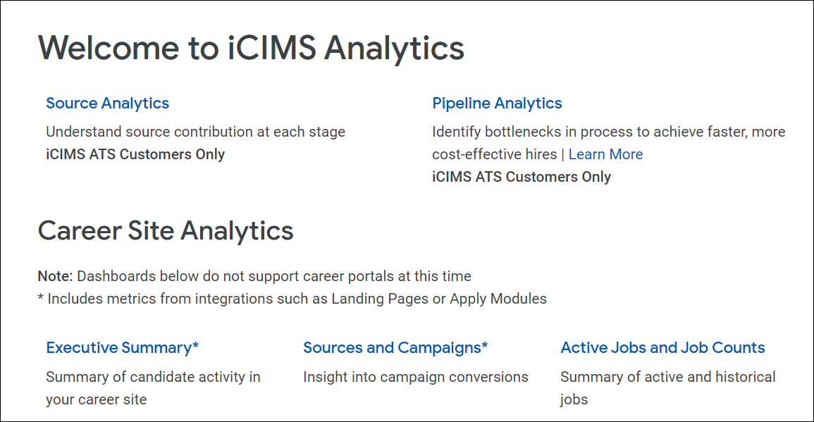
Source Analytics
This dashboard measures career site traffic and the effectiveness of hiring sources. Recruiters can determine what proportion of candidates come from different sources at every major step of the hiring funnel.
Pipeline Analytics
This dashboard measures pipeline performance from application start to hire. Recruiters can determine if they are on target with their hiring goals and identify bottlenecks in the recruiting process.
DEI Analytics
This dashboard measures demographic data against job data to uncover gaps and disparities among different groups. The metrics provided enable you to better build and refine your Diversity, Equity, and Inclusion (DEI) strategy, track your DEI goals, and measure progress against these goals.
Notes:
-
The DEI Analytics dashboard is off by default but can be enabled by submitting a case to iCIMS Technical Support.
-
This dashboard is created based upon the data contained in a customer’s database, and therefore may not be complete or accurate, including to the extent candidates did not provide such information as part of their application.
Making the Most of ATS Data
To help you make the most out of the data available on ATS dashboards, a few additional tips are listed below:
For ATS analytics to populate correctly, map your bins and statuses to a hiring stage via Admin > System Configuration > Applicant Tracking > Configure > Workflow > Recruiting Workflow Bins and Statuses. Mapping bins and statuses allows the system to collect data points for every recruiting workflow change that is made (e.g., a recruiter moves a candidate from Interview to Offer); these data points are then used to compute the analytics on these dashboards.
Notice that the five different hiring stages available for selection in this window (Initial Review, Screen, Interview, Offer, Hired) are reflected in various tiles on the Pipeline Analytics dashboard, particularly in the Candidate Pipeline section.
Mapping your bins and statuses also ensures you are getting proper source analytics. For instance, you may notice that some sources drive a lot of candidate applications but don’t represent a large portion of hires. The tiles in the Hiring Stages by Source section of the Source Analytics dashboard can help you find the stage(s) where candidates are dropping off.

